Feather UI Essentials Pack Vol. 1
The Feather UI Essentials Pack Vol. 1 brings 35 unified outline icons into one package — no more mixing styles across screens.
Each icon ships as a clean SVG plus three PNG sizes (24×24, 48×48, 256×256) so you’re covered for every UI scale.
Works equally well in product UIs, brand decks, internal tools and documentation sites.
Use it as an `` source, inline `
Hit Download to grab the bundle. Free, no signup needed.
Heroicons 24 Solid UI Essentials Pack Vol. 2
A coherent set of 31 24 Solid icons, the Heroicons 24 Solid UI Essentials Pack Vol. 2 keeps your UI looking consistent from header to footer.
All 31 icons come as optimised SVGs (currentColor-friendly) and pre-rendered PNGs at 24, 48 and 256 pixels.
Wire it into your design system, your marketing site, your slides — every screen ends up speaking the same visual language.
Import into Figma, Sketch, Illustrator, Webflow, Notion, Framer — or paste the SVG markup straight into your component.
Tap Download to pull the bundle. Use it however you want.
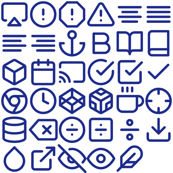
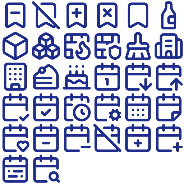
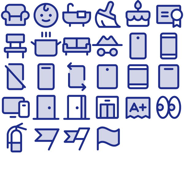
Lucide Circle Pack Vol. 2
The Lucide Circle Pack Vol. 2 bundles 23 carefully drawn outline icons into a single drop-in set.
All 23 icons come as optimised SVGs (currentColor-friendly) and pre-rendered PNGs at 24, 48 and 256 pixels.
Built for product teams: dashboards, settings panes, empty states, marketing pages and onboarding flows all in one aesthetic.
Use it as an `` source, inline `
Tap Download to pull the bundle. Use it however you want.
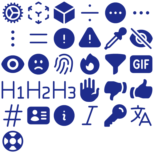
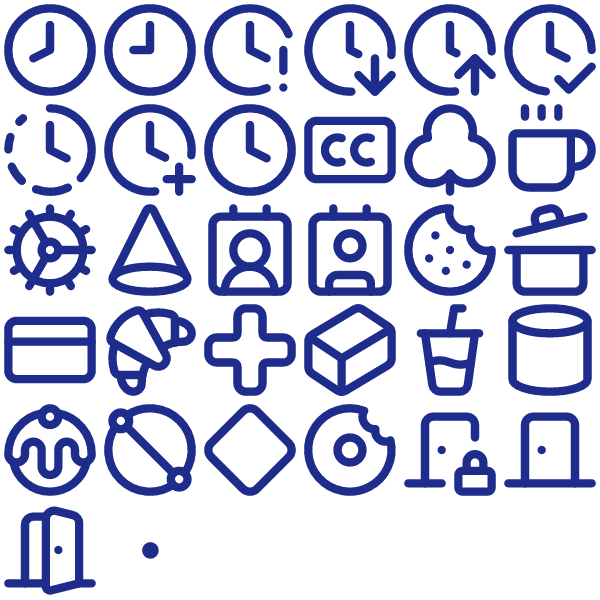
Lucide UI Essentials Pack Vol. 2
Designed for builders who hate hunting for icons, the Lucide UI Essentials Pack Vol. 2 packs 32 outline-weight symbols ready to go.
All 32 icons come as optimised SVGs (currentColor-friendly) and pre-rendered PNGs at 24, 48 and 256 pixels.
Wire it into your design system, your marketing site, your slides — every screen ends up speaking the same visual language.
Pull the SVG into Figma or your preferred design tool, or wire the file into your codebase and recolour with CSS.
Hit Download to grab the bundle. Free, no signup needed.
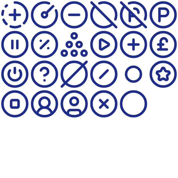
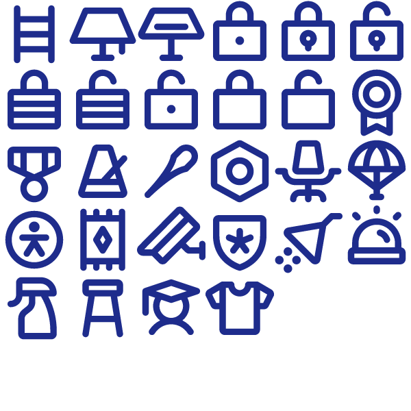
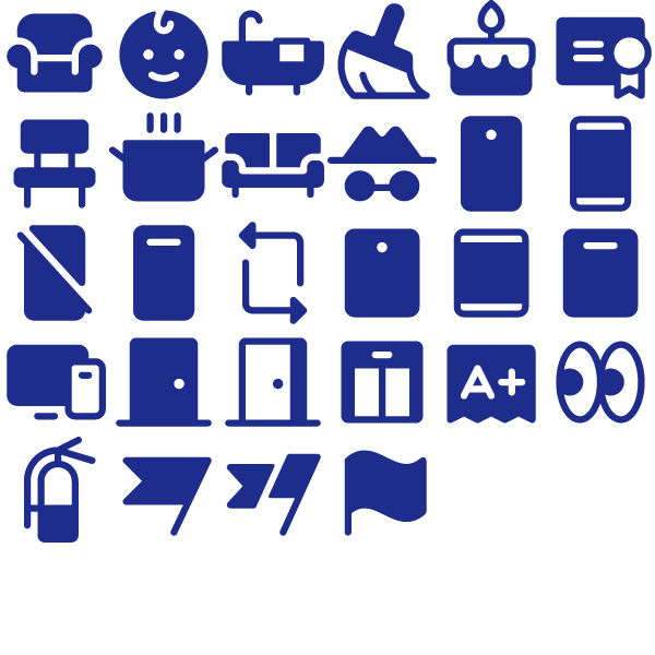
Lucide UI Essentials Pack Vol. 4
Designed for builders who hate hunting for icons, the Lucide UI Essentials Pack Vol. 4 packs 32 outline-weight symbols ready to go.
All 32 icons come as optimised SVGs (currentColor-friendly) and pre-rendered PNGs at 24, 48 and 256 pixels.
Works equally well in product UIs, brand decks, internal tools and documentation sites.
Drop the SVG straight into Figma, Webflow, your codebase or any modern editor — the file is currentColor-friendly so it picks up the surrounding text colour.
Hit Download — the files land on your machine in seconds.
Phosphor Bold UI Essentials Pack Vol. 3
28 Bold icons strong, the Phosphor Bold UI Essentials Pack Vol. 3 is built to cover the most-used glyphs in UI Essentials interfaces.
The bundle contains 28 SVGs alongside three PNG renders per icon — useful when SVG isn’t an option.
Wire it into your design system, your marketing site, your slides — every screen ends up speaking the same visual language.
Use it as an `` source, inline `
Hit Download — the files land on your machine in seconds.
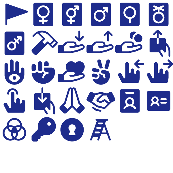
Phosphor Bold User Pack
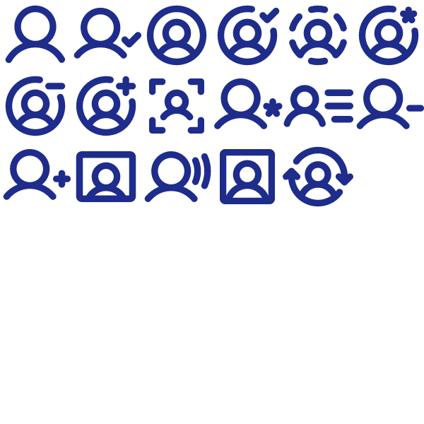
The Phosphor Bold User Pack bundles 17 carefully drawn Bold icons into a single drop-in set.
Each icon ships as a clean SVG plus three PNG sizes (24×24, 48×48, 256×256) so you’re covered for every UI scale.
Wire it into your design system, your marketing site, your slides — every screen ends up speaking the same visual language.
Import into Figma, Sketch, Illustrator, Webflow, Notion, Framer — or paste the SVG markup straight into your component.
Grab the files via the Download button. No account, no email gate.
Phosphor Duotone UI Essentials Pack Vol. 1
A coherent set of 28 Duotone icons, the Phosphor Duotone UI Essentials Pack Vol. 1 keeps your UI looking consistent from header to footer.
Inside the zip: SVG sources for every icon plus three PNG sizes per glyph — drop the format you need where you need it.
Wire it into your design system, your marketing site, your slides — every screen ends up speaking the same visual language.
Drop the file into your project, recolour with CSS `color`/`fill`, and you’re done.
Hit Download to grab the bundle. Free, no signup needed.
Phosphor Fill UI Essentials Pack Vol. 1
Designed for builders who hate hunting for icons, the Phosphor Fill UI Essentials Pack Vol. 1 packs 28 Fill-weight symbols ready to go.
All 28 icons come as optimised SVGs (currentColor-friendly) and pre-rendered PNGs at 24, 48 and 256 pixels.
Slot the icons into navigation, feature lists, comparison tables, settings panels — wherever a coherent symbol set helps.
Open the SVG in any vector editor, drop it into a Figma frame, or include the file directly in HTML/JSX.
Hit Download — the files land on your machine in seconds.
Phosphor Fill UI Essentials Pack Vol. 2
The Phosphor Fill UI Essentials Pack Vol. 2 brings 28 unified Fill icons into one package — no more mixing styles across screens.
Inside the zip: SVG sources for every icon plus three PNG sizes per glyph — drop the format you need where you need it.
Wire it into your design system, your marketing site, your slides — every screen ends up speaking the same visual language.
Use it as an `` source, inline `
Click Download to get the files — free for personal and commercial work.