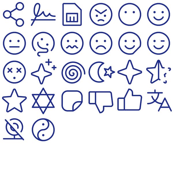
Communication Pack Vol. 3
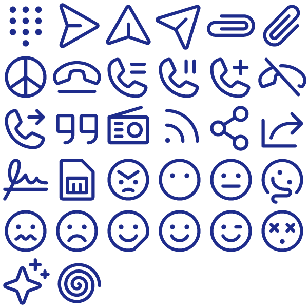
Designed for builders who hate hunting for icons, the Communication Pack Vol. 3 packs 32 mixed-weight symbols ready to go.
Files are organised into svg/ and png/ folders with sizes 24, 48 and 256 — easy to wire into any asset pipeline.
Built for product teams: dashboards, settings panes, empty states, marketing pages and onboarding flows all in one aesthetic.
Import into Figma, Sketch, Illustrator, Webflow, Notion, Framer — or paste the SVG markup straight into your component.
Click Download to get the files — free for personal and commercial work.
Heroicons 24 Solid Communication Pack
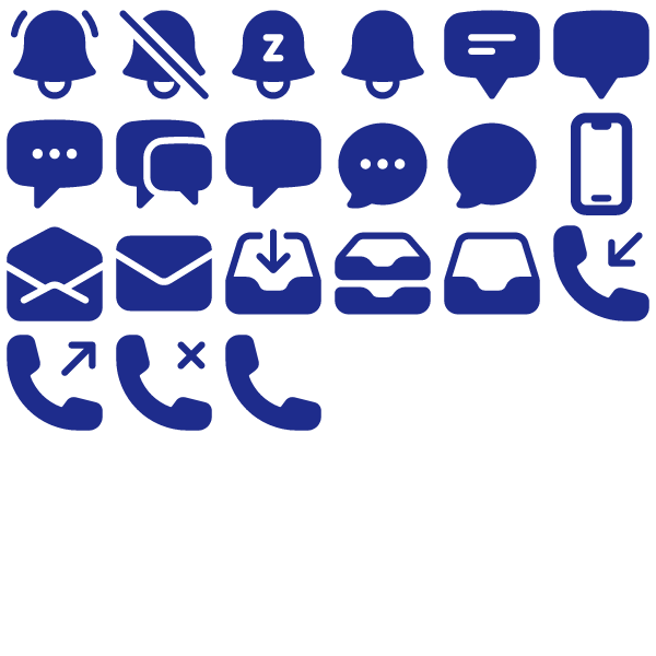
The Heroicons 24 Solid Communication Pack bundles 21 carefully drawn 24 Solid icons into a single drop-in set.
Files are organised into svg/ and png/ folders with sizes 24, 48 and 256 — easy to wire into any asset pipeline.
Works equally well in product UIs, brand decks, internal tools and documentation sites.
Drop the file into your project, recolour with CSS `color`/`fill`, and you’re done.
Click Download to get the files — free for personal and commercial work.
Phosphor Bold Communication Pack Vol. 4
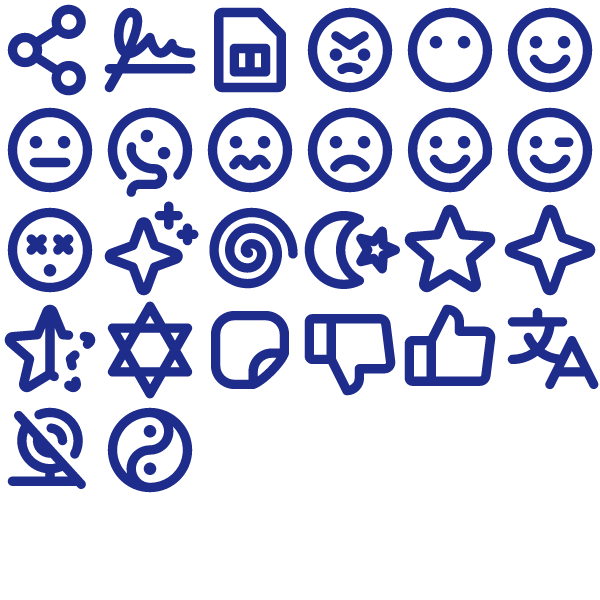
A coherent set of 26 Bold icons, the Phosphor Bold Communication Pack Vol. 4 keeps your UI looking consistent from header to footer.
All 26 icons come as optimised SVGs (currentColor-friendly) and pre-rendered PNGs at 24, 48 and 256 pixels.
Wire it into your design system, your marketing site, your slides — every screen ends up speaking the same visual language.
Import into Figma, Sketch, Illustrator, Webflow, Notion, Framer — or paste the SVG markup straight into your component.
Click Download to get the files — free for personal and commercial work.
Phosphor Light Communication Pack Vol. 4
26 Light icons strong, the Phosphor Light Communication Pack Vol. 4 is built to cover the most-used glyphs in Communication interfaces.
All 26 icons come as optimised SVGs (currentColor-friendly) and pre-rendered PNGs at 24, 48 and 256 pixels.
The set covers most of the common iconography needed for product UIs, marketing pages, dashboards and apps.
Open the SVG in any vector editor, drop it into a Figma frame, or include the file directly in HTML/JSX.
Download the bundle and put it to work — free to use on any project.
Phosphor Light Smiley Pack
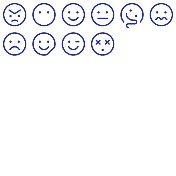
10 Light icons strong, the Phosphor Light Smiley Pack is built to cover the most-used glyphs in Communication interfaces.
Inside the zip: SVG sources for every icon plus three PNG sizes per glyph — drop the format you need where you need it.
Built for product teams: dashboards, settings panes, empty states, marketing pages and onboarding flows all in one aesthetic.
Open the SVG in any vector editor, drop it into a Figma frame, or include the file directly in HTML/JSX.
Grab the files via the Download button. No account, no email gate.